

|
|
|
 |
| 07-09-2011, 12:38 PM | #45 |
|
Warranty Killer

126
Rep 1,014
Posts |
Since you're shooting against the sunlight, If possible, try to use a gold reflector to add some light and skin tone.
__________________
EUROPROJEKTZ Midwest Member
08 335i Jet Black | too much to name....  |
|
Appreciate
0
|
| 07-10-2011, 07:41 PM | #46 |
|
Major General
  
703
Rep 5,382
Posts |
For ichiban: nice exposure and perspective, would try to work on composition though.

__________________
|
|
Appreciate
0
|
| 07-10-2011, 07:45 PM | #47 |
|
Major General
  
490
Rep 6,798
Posts |
Is you car in a computer game Billy?

__________________
|
|
Appreciate
0
|
| 07-10-2011, 08:00 PM | #48 |
|
Major General
  
1296
Rep 7,389
Posts |
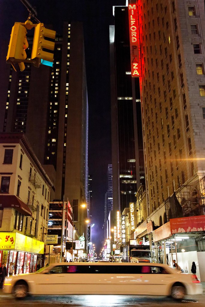
I really like it Bill. The only thing I'd do different is put a little more space in front of the car than in back, or equalize space front and back. Great exposure values and processing.
Here's mine:  Streeetch... by dcstep, on Flickr
__________________
|
|
Appreciate
0
|
| 07-10-2011, 08:53 PM | #49 |
|
Major General
  
703
Rep 5,382
Posts |
does the sky look fake? i took one shot of the sky and another of the car properly exposed then combined them.
__________________
|
|
Appreciate
0
|
| 07-10-2011, 09:02 PM | #50 | |
|
Major General
  
490
Rep 6,798
Posts |
Quote:

__________________
|
|
|
Appreciate
0
|
| 07-11-2011, 12:26 AM | #51 | |
|
Subscribed

127
Rep 1,179
Posts |
Quote:
|
|
|
Appreciate
0
|
| 07-11-2011, 12:28 PM | #52 |
|
Major General
  
1296
Rep 7,389
Posts |
I thought that it looked HDR overdone, but didn't say anything against it because so many seem to like that.
__________________
|
|
Appreciate
0
|
| 07-17-2011, 10:03 AM | #54 |
|
Major General
  
748
Rep 7,308
Posts
Drives: see above.
Join Date: Apr 2005
Location: Yorkshire, UK
|
Background is distracting. I'd like to see more space around the car. Nice reflections on the paint and good colours.
__________________
|
|
Appreciate
0
|
| 07-18-2011, 10:28 PM | #56 | |||
|
is probably out riding.

6059
Rep 2,292
Posts |
Quote:
Quote:
Quote:
The car shot looks like it was an impulse shot as it was in a parking spot. car is under exposed and i personally don't like a half car photo. There is no real subject there. The frame is split between the car and the concrete structure. Not a great time to shoot, the harsh light creates half under exposed and half over exposed. Ok, now that we're back on track.... 
__________________
"There is no greater tyranny than that which is perpetrated under the shield of the law and in the name of justice. -Charles de Secondat"
 Last edited by Mr Tonka; 07-18-2011 at 10:38 PM.. |
|||
|
Appreciate
0
|
| 07-18-2011, 10:57 PM | #57 |
|
Free Thinker

19079
Rep 7,532
Posts |
__________________
|
|
Appreciate
0
|
| 07-19-2011, 12:25 AM | #58 |
|
. . .
188
Rep 2,391
Posts |
thank you, Joe.
__________________
2009 135i | space grey | sport | navi | hifi | heated
dinan stage 2 software | bmw performance exhaust kw v2 | hotchkis front sway | vmr v710  |
|
Appreciate
0
|
| 07-19-2011, 08:54 AM | #59 |
|
Major General
  
1296
Rep 7,389
Posts |
Yes indeed, we are back on track.
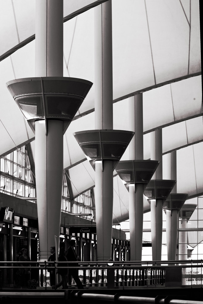
I can't find anything "wrong". You either got up early for dawn or stayed late for the sunset to capture wonderful natural saturation of this scene. The balance of the composition is perfect, with the coastline leading your eye out of the frame. It would be even more stupendous IF mother nature had cooperated and thrown a few dramatic clouds into the sky. Still, this exemplary of nature, scenic and wildlife photography, you can plan, check the weather forecast, set up and wait, but we're not totally in control. Well done. I posted this earlier, but received no critique, so here goes again: Denver International Airport Interior:  DIA's main lobby in morning light... by dcstep, on Flickr
__________________
|
|
Appreciate
0
|
| 07-19-2011, 10:28 AM | #60 | ||
|
is probably out riding.

6059
Rep 2,292
Posts |
Quote:
My pleasure. Quote:
 The sun was below the horizon about 7 minutes after taking the pics. The sun was below the horizon about 7 minutes after taking the pics.I didn't have time of course, but i wonder how this would have looked if i just took a single image with my 16-35 rather than three with the 24-70. At the time i felt like the 16-35 would make the subject appear further away. Sorry for the extra post, but i love hearing the stories about how or why the image was captured. Figured i'd share mine Hopefully someone will jump in and critique your Denver Airport shot; cause i don't have a bad thing to say about it. Technically speaking it seems to be great. Composition is super interesting. I love how the perspective lines cross. How the posts go from left to lower right and the arches draw your eyes from right to lower left. Very interesting image, something i can imagine seeing on the wall in a nice restaurant or home.  I'll let someone else take a crack at it and post their image.
__________________
"There is no greater tyranny than that which is perpetrated under the shield of the law and in the name of justice. -Charles de Secondat"
 |
||
|
Appreciate
0
|
| 07-19-2011, 10:48 AM | #61 | |
|
Major General
  
1296
Rep 7,389
Posts |
Quote:
Since you started it, I'm often out at DIA waiting to pick up a daughter or granddaughter with a little time on my hands, so I'll take the 5D MkII with the 24-105mm lens and look for a shot. There are lots of interesting shapes there, but most of my prior shots were duds, so I was determined to get something worth keeping. The sun was still relatively low in the East (left) of this image, so the shadows added extra dramatic elements to the image. When I got home and started process, it still seemed flat as I looked at it in color and pumped the contrast up and down, when it hit me to use B&W to gain more freedom with Contrast. The resulting B&W image pleased me much more, seeming appropriate for the white roof and dark, strong shadows. Dave
__________________
|
|
|
Appreciate
0
|
| 07-19-2011, 01:57 PM | #63 |
|
Major General
  
1296
Rep 7,389
Posts |
No, I enjoy talking with the TSA...

__________________
|
|
Appreciate
0
|
| 07-19-2011, 02:11 PM | #64 | |
|
. . .
188
Rep 2,391
Posts |
Quote:
Composition is good (except for that black slit on the upper right of the frame, but whatever. Great shot. The Salk:
__________________
2009 135i | space grey | sport | navi | hifi | heated
dinan stage 2 software | bmw performance exhaust kw v2 | hotchkis front sway | vmr v710  |
|
|
Appreciate
0
|
| 07-19-2011, 04:46 PM | #65 |
|
Major General
  
1296
Rep 7,389
Posts |
Oh man, thanks Rodi. I totally missed that black slit in the upper right and it'll be an easy fix.
I was going for mid-greys, but I like your suggestions about exposure. (I did pump things up and down and landed on this look on purpose). I DID have time to shoot more around the people. I actually had one without them. There's an escalator that the one faced toward our right went down, but, yes, I should have invested more time to add clarity there. I like your Salk a ton, but that black shape floating toward the right side of infinity is bothering me. I can't figure what it is and it's calling attention to itself because it's totally black. The rich colors and perspective are wonderful as is the balance in the composition. Hopefully someone else will comment further on your image since I came back to answer your questions mainly. Dave
__________________
|
|
Appreciate
0
|
| 07-19-2011, 04:51 PM | #66 | |
|
. . .
188
Rep 2,391
Posts |
Quote:
i should have posted the larger version? the photo is over 3 years old, i should probably process it with my new ways. but thanks!
__________________
2009 135i | space grey | sport | navi | hifi | heated
dinan stage 2 software | bmw performance exhaust kw v2 | hotchkis front sway | vmr v710  |
|
|
Appreciate
0
|
Post Reply |
| Bookmarks |
|
|